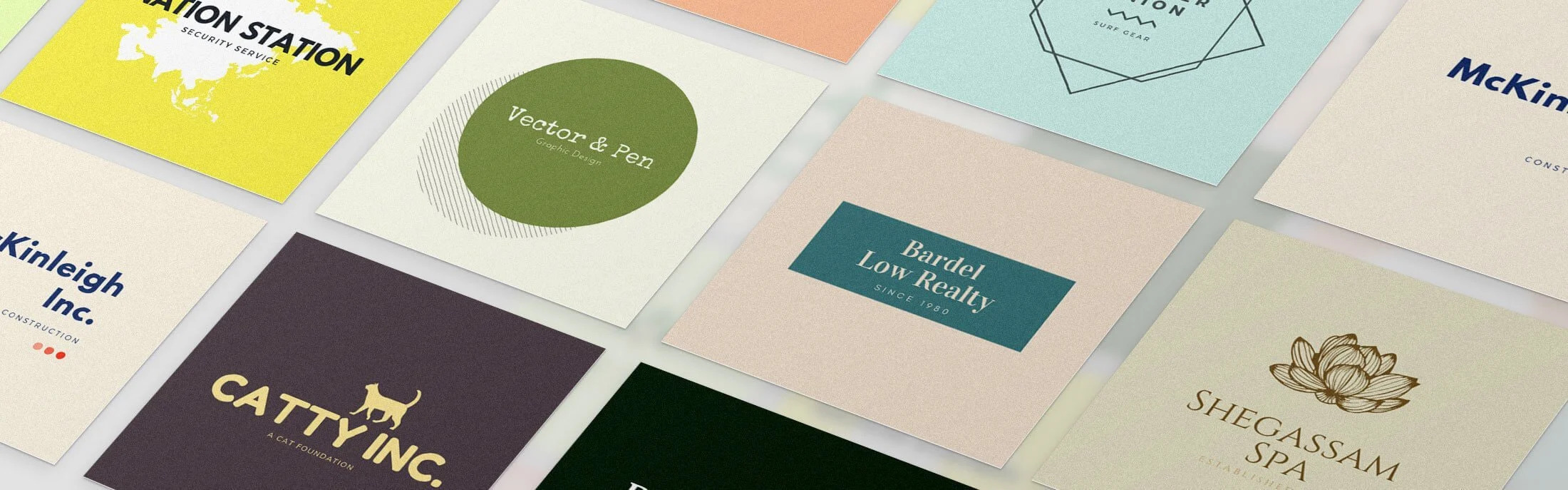
Logo designing is not easy; it takes a lot of research and creativity to show the whole brand’s ideology and beliefs in a logo. There are several platforms available that can give you the wings for your creativity; one such platform is create.vista.com. You should visit this site so that you can have a space where you can spread your wings of creativity.

1.Don’t get bound by the time limits.
A logo should be evergreen and remain relevant no matter how many years pass. Stop chasing the trends and try to stand out. Also, don’t go for any local culture as the brands are global.
It should be simple and memorable; when a logo holds meaning and uniqueness to it, people tend to remember that logo unconsciously.


2.Keep the target audience in mind.
Branding is what helps you in gaining an initial audience. While designing a logo, you need to focus on what type of audience you are targeting for.
Based on the audience, you should prepare the message you will relay with the logo.
3.Make it look alive.
A good logo tells the story and conveys the feeling of a brand. Dig deeper and do proper research related to the brand.
4.Make sketches
Always make rough sketches on paper before you start heading towards a drawing board.
Sketching on paper would actually widen your horizon as you would be able to track your mistakes and add or remove certain things from a logo, and in the end, you’ll have your final idea of the logo with a rough design.
5.Get second opinions
It’s only human to make mistakes; any can make mistakes; it’s always better to get a second opinion. Sometimes you can miss out on something which others might catch.
Discuss your logo concept with others to understand a logo’s cultural misunderstanding, hidden meanings, etc.
6.Interactive logo
Instead of making a boring logo, go for something unique and make a logo interacting; a logo should fulfill the basic needs of recognizability and the idea which represents the business.
Study the brand closely and create a logo that is capable of relaying the brand’s values and beliefs.
7.Positive perception is the key
If you are designing a logo, it’s the most basic and obvious thing to show the positive side of a brand.
A logo should give a strong impression of a brand’s perception. As it would gain the audience’s trust for the brand.
8.keep it simple and sober
Don’t go for a design that is very busy and hard to understand. A logo should be simple and soothing for the eyes.
9.Keep the logo authentic
Don’t try to copy others’ styles of logo making. You should get inspired by others but should never copy others; it would reduce your credibility as a creator.
Try to put the brand’s authenticity in the logo because a logo represents a brand; it should be representable, engaging, and authentic.
10.Add freshness with colors
Colors can make anything beautiful, and by using proper color anatomy, you can create a masterpiece in the form of a logo.
Beautiful things attract people’s eyes towards it. So use colors to give a freshness to the logo.
Also, certain businesses use a particular color for their brand and associate their brand with that color. Analyze the brand’s competitors and choose the color wisely.
11.Analyze your competition
Analyze the logos of a brand’s competitor in order to know if your design and colors are unique and whether it can stand out or not.
12.Standout with a memorable design
People get the impression that your brand is a copy or similar to another brand just because there are minor similarities in the logo.
This is why it is important to stand out and design a unique logo.
13.Fonts can be your friend or foe
Typefaces speak a lot, even if there is nothing written in particular. Fonts can be soothing or horrifying. You should always pay attention, which type of font you are using because the impression matters a lot.
14.Don’t be literal
A logo represents your business, but you don’t need to put an image of the business in the logo. There is no need to do that. For example, Apple is a tech-based Company, but its logo is a bitten apple and not something tech-based.
15.Negative space
The space which is vacant between two letters is known as negative space. Using negative spaces shows the creativity of the designer. You can also use negative spaces to show some uniqueness in the logo.


