Not only do colors play a vital role in our natural environment, but also the environment created by man. For many people, colors in buildings and architecture are nothing but a decoration element. However, colors in architecture influence everything, from how we perceive our environment to how we feel.
In other words, color is a visual language common to all humans. When we want to communicate through art and design, nothing comes closer to color. For instance, color plays a vital role in the perception of space. When lighter color is used, it has a visual impact of making the space look bigger. On the flip side, when you apply darker shades, the space will appear smaller.
Color also plays a vital role in how stimulated your building environment is. While a weak or monotonous color in architecture makes the building less stimulated, sharp and saturated colors represent an overly stimulated building environment.
The kind of ambiance you desire also determines the color choice of your building material. For instance, an office can feature an exciting and energizing environment, while a hotel can feature a calming and relaxing atmosphere.
The Psychology of Colors: What Colors Express
If you are like many, not all colors excite you. Or rather, you aren’t indifferent to colors, meaning you have your own taste for what looks cool, shouty, classy, etc. That said, below is a quick summary of the popular colors and what they mean.
- White – represents purity and neutrality. On interior walls, they convey openness and enormity. Not to mention that they make the space appear brighter.
- Yellow – Due to its radiant and cheerful consistency, yellow is suitable for children’s spaces such as daycares and kindergartens.
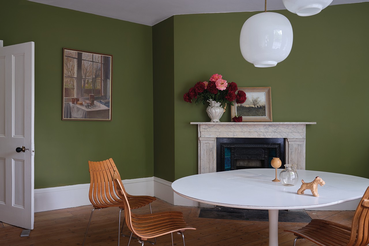
- Green – Despite green walls being an unusual color for architecture, they can be used to convey simplicity and nature. It creates a calm and balancing environment.
- Red – While red can connate passion and excitement, it also represents danger or fear. In specific scenarios, touches of red can be used to point people to particular objects or spaces.
- Purple- Apart from being dramatic and sophisticated, purple color, particularly pastel purple, can be soft and relaxing.
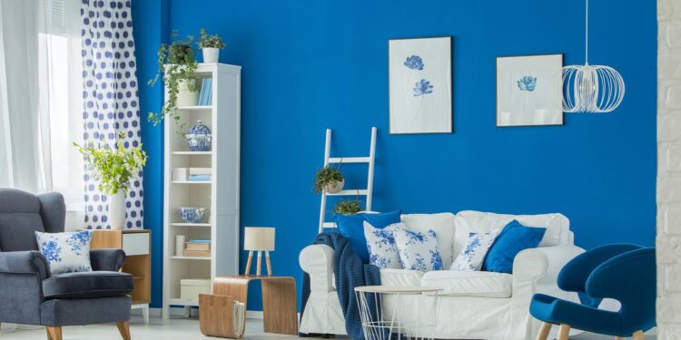
- Blue- Blue depicts some sense of dignity and security.
- Black- Despite making interior walls dark and oppressive, black signifies class and makes spaces feel sleek.
What to Consider Before Choosing a Color for Your Building
In many ways, the color you choose for your building will go a long way in deciding how and who will use the space. First, the choice of architecture and the building materials play a huge role in choosing the right color. Generally, older buildings favor neutral and less shouting colors. On the other hand, you can try bolder colors with modern buildings to add a sleek feel.
Secondly, consider the impression you’d like to make. For instance, if your property hosts businesses like banks or law firms, you’ll want to convey a sense of trust and responsibility. Here, you should go for grey, black and brown colors. If a specific color is associated with your brand, you may want to reflect this in your building as well.
Last but not least, you may want to consider what combination of colors will fit best to create an impressive and long-lasting impression. Deciding whether you’d prefer complementary colors or analogous colors perhaps will make it easier for you to choose.

Mixing Colors and Material
In every work of art, such as designing a building or decorating an interior space, taking the time to think of the perfect choice of colors and material is crucial. An architect, for example, should be aware of the client’s ideal facade before deciding on which construction materials to use.
An eye-catching facade is usually created through the creative use of building materials and color. Here, there’s also a need to consider the structural integrity of the materials to ensure they are functional and durable. Mixing and matching these requirements to find the perfect material and color combination may take some bit of trial and error.
Here are some tips you can use to choose the right color and material combination:
- Evaluate the appearance, feel, and color of the surface. Similarly, check the other surface conditions such as thickness and opacity.
- Sort out the most suitable colors from those that are less desirable for the different materials and surfaces.
- Use a sample material that acts as a control experiment to try out the color and material combination.
- Seek help where necessary.
Making Your Designs Stand Out
As far as you know, the purpose of the design and the clients’ expectations, finding the perfect color and material combination shouldn’t be stressful. Feel free to try any recommendations we’ve highlighted above and also to seek help from an interior designer where necessary. Whether designing a building or renovating your home, matching your best color with the building material will make the design stand out.


