Choosing the right paint color for your home can be a daunting task – especially when deciding whether to go for neutral tones or bold, vibrant shades. While there’s no one-size-fits-all answer, understanding the effect these colors have on a space – and on your mood – can help you find the perfect balance between calm and excitement in your home. Ultimately, the key to choosing the right paint is staying true to your personal style and creating a space that makes you feel at home.
The Appeal of Neutral Paints
Neutral paints are timeless and versatile, making them an easy choice for many. Shades of white, beige, gray, and taupe serve as a calming backdrop that can make a room feel airy and expansive. These colors work well in spaces where you want to create a sense of tranquility or simplicity. Neutral tones can also act as a canvas for adding texture, art, and décor elements that really stand out.

Best Uses for Neutrals:
Small Spaces
Light neutrals can make rooms appear larger and more open. If you have a small room or apartment, painting walls in soft whites, light grays, or beiges can help create the illusion of space.
Open-Concept Areas
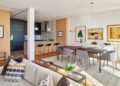
Neutral colors work well in open floor plans to create a cohesive flow between rooms. Soft tones allow each space to feel connected without overwhelming the eyes.
Calming Retreats
Bedrooms and bathrooms are great spaces for soft neutrals. Using shades like light gray, soft beige, or even pastel hues can create a peaceful, restful environment ideal for unwinding.
Timeless Style: If you prefer a classic, elegant style, neutral paint colors can be the foundation of a more refined, sophisticated look. Consider pairing neutral walls with luxurious finishes such as metallic accents or rich wood tones.
The Allure of Bold Colors
On the other hand, bold paint colors are ideal for those who want to make a statement and bring a sense of drama to their space. From deep blues to vibrant yellows and dramatic greens, bold colors can help create an energetic atmosphere or add character to a room. They’re perfect for highlighting areas of the home you want to draw attention to, like accent walls, furniture pieces, or architectural features. Bold colors can also serve as a reflection of your personality and style, making them a powerful tool for self-expression.

Best Uses for Bold Colors:
Accent Walls
One of the easiest ways to incorporate bold colors is by using them on a single accent wall. A rich navy blue, dark emerald green, or fiery red can create a dramatic focal point without overwhelming the entire room.
For more accent wall ideas, browse this article from Benjamin Moore.
Statement Rooms
Dining rooms, living rooms, and home offices are great places for bold hues. These areas are often meant to impress or energize, so a vibrant color can make a strong impact.
Mood Enhancement
Colors like yellow, orange, and red can stimulate creativity, energy, and conversation, making them perfect for spaces where you entertain guests or get things done, such as a kitchen or a home office.
Personal Expression
Bold colors are great for spaces that reflect your personality. If you love to be surrounded by bright, energizing hues, incorporate them in places where you’ll spend a lot of time.
Mixing Neutrals and Bold Colors
There are no rules in interior design, so there’s no need to choose one or the other. In fact, a combination of both can create the perfect balance between calm and excitement. If you love the serenity of neutrals but crave the energy of bold colors, you can blend the two styles within a room or even across your entire home.
Here’s How to Blend the Two:
Start with a Neutral Base
If you’re unsure about going full throttle with bold colors, start with neutral walls and then incorporate bold accents through furniture, throw pillows, rugs, or artwork. A neutral sofa with bold cushions or a neutral dining room with a colorful chandelier can be an eye-catching combo.
Bold Pops of Color
Bold colors don’t have to dominate a room. A striking accent chair, a bright rug, or bold wall art can bring in just the right amount of color without overwhelming the space.
Use Color Schemes
If you’re mixing neutrals with bold colors, using a color palette can help maintain balance. For example, pair a deep blue with lighter neutrals like white or beige to soften its impact. You can also combine two bold colors with neutral accents in between to allow each hue to shine without clashing.
Consider Texture and Contrast
Neutrals work beautifully when paired with rich textures, such as velvet, wood, or metal. Consider pairing a soft neutral base with bold colored accessories that stand out due to their texture, like a bold yellow throw blanket on a neutral beige couch.
Create a One-of-A-Kind Space
At the end of the day, choosing whether to go for neutrals or bold colors comes down to your personal preference and the vibe you want to create in your space. You should feel comfortable, inspired, and truly at home in every room of your home. If you’re in the Carlsbad area and ready to refresh your space with the perfect paint colors, Pinnacle Development & Renovation is here to help. Our painting services will help bring your vision to life. Learn more about how we can transform your home into a space that truly reflects your personal style and preferences.


