The best color combination in the interior of the hallway: shades of walls, floor, furniture
The hallway – not just the starting point of the design project of an apartment or house. It is the first impression and a hint of the main stylistics.
To make the room look stylish, you need to think about the color solution in the first place. It is the one that creates the mood and evokes certain emotions.
How to find the optimal combination of colors in the interior of the hallway?
Carefully study the parameters of the room: height, width, length, shape. Do you remember that dark tones “take away” the area, and light ones add? Of course, it’s only about visual perception, but believe me, it can work wonders. If there is not enough length, choose finishing materials or furniture with horizontal stripes. Need to raise the ceiling? Pay attention to finishing materials with vertical lines.
Decide on the style in advance because each has its own set of colors:
- It is difficult to imagine empire and baroque without white, turquoise, gold, red and blue.
- Minimalism is characterized by black, gray, white, and pastel colors.
- Fusion is remembered for its unconventional combinations – gold with bright pink, muted pastel shades with rich lettuce, etc.
- Provence does not like bright colors, especially in the base. Light blue, cream, pale purple, mint are suitable as a background, and lemon and olive are good accents.
- Classic and modern is associated with wood and pastel colors, green, sandy, white.
- The rococo interior is a combination of pink, cream, gold, white and turquoise.
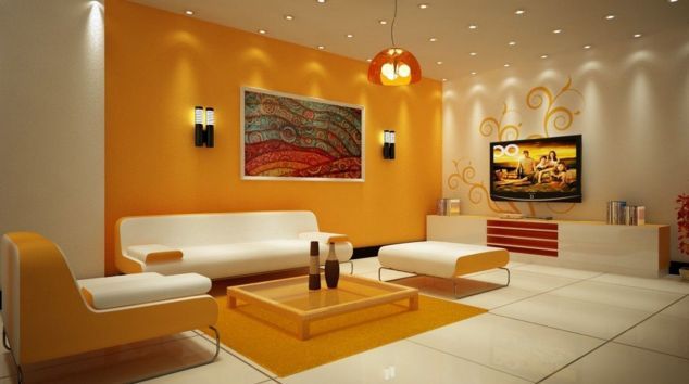
Pop art is exciting and complex at the same time. It has a lot of bright spots that are set against a background of yellow, orange, pink, or blue.
The direct opposite is a loft and hi-tech, which do not involve the presence of “juicy,” “screaming” tones at all. They are based on white, black, metallic, gray, and terracotta.
Choose finishing materials in the right colors.
The easiest thing to do with the floor. Here, practicality is much more important than external appeal. That’s why many stop at the dark and neutral tones. The main thing is to stick to the basic design rules.
In large corridors, you can safely experiment with contrasts, and in small ones, use different combinations of blue and gray. If you want to focus on the floor, make the walls neutral. Save the volume helps the ceiling, which is lighter by a couple of tones. Glossy surfaces are also ideal for increasing the space.
In small rooms, the ceiling should not be contrasting. Otherwise, it will just divide the already small space into parts. A vast dark cornice will make the room lower, and a neutral light one with the same walls will make it higher.
The design of the walls will be the central element. In narrow rooms, active patterns should be avoided. An unobtrusive horizontal way is suitable for expansion, a variety – gradient. A win-win variant would be the use of neutral gamma. Thanks to the beige color, you will emphasize the advantages of the hallway, freeing guests from the desire to look closely into the details.

What color to paint the hallway: dark or light?
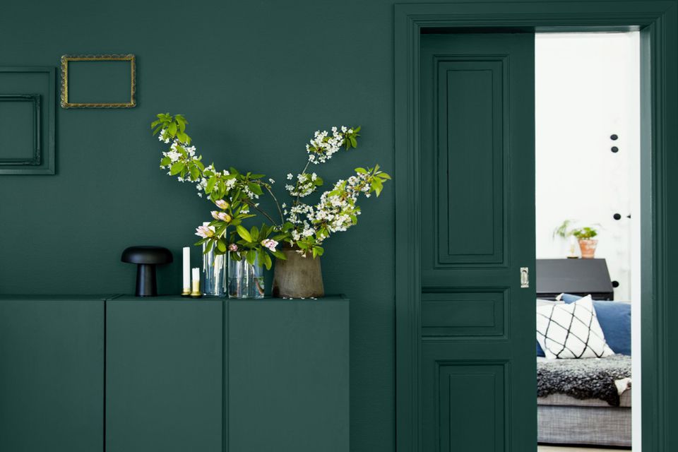
Dark shades make the space functional, attractive and unusual. They will look even more winning together with concealed lighting along with the ceiling. A Gray or blue corridor will hide the dust and dirt from view. Competently chosen contrasting combinations of colors will get rid of gloominess and monotony. The dark blue scheme mustn’t dominate, and the walls are not painted in very dark shades of brown and gray.
Since the hallway has no windows, it has no natural light. They artificially add light – with a light ceiling, wallpaper or plaster, linoleum, laminate, flooring. In addition, it allows you to increase the area of the room visually.
White and close to it tones help to save on lighting fixtures. Light turquoise and the blue line the walls and hide the weaknesses of the layout; pistachio and olive have a positive effect on the psyche and create a pleasant microclimate. The only disadvantage is that you will have to be especially careful to maintain cleanliness.
Stylish hallway in blue
What are the peculiarities of the color blue? It sets up for reflection, a calm way, turns on the mind.
If your windows face east, nothing prevents the light from penetrating inside your apartment or house, and the thermometer’s column always shows “+,” take a closer look at the blue. It will give you a feeling of comfort and security, a desire to return home again and again. In order not to go overboard, look in advance for the most suitable tones and combinations.
The combination of blue and white is one of the best solutions. It is free space and freshness in one “bottle.” The percentage ratio will depend on the size of the corridor. In a small one, white will be the basis, and in a spacious one, blue. Experts advise installing neat furniture made of wood in such interiors as chestnut, cherry, or dark walnut.
Not a bad alternative – a combination of green and blue. The most advantageous are considered shades of olive and fresh greenery, foliage. Adding a small wicker sofa and light accessories involuntarily creates a romantic, “weightless” mood.
A bolder and more festive combination is blue and orange. It is often used when decorating the interior in the oriental style and in those cases where the square footage is catastrophically lacking.
A timeless classic, or hallway in black and white
White together with black always looks elegant and refined. This combination is appropriate in any hallway, regardless of their size. In large rooms, the walls, ceiling, or floor can be completely black. Particularly relevant will be the dark floor – one of the trends of recent seasons.
In a small corridor, the main thing should be white, and black and other dark colors are suitable for decoration. The arch doorway and a minimum amount of furniture will help to increase the space.
The black and white palette is best complemented by bright red and yellow tones, gold, and silver. Decorate the hall with metal hangers for clothes, lamps, paintings in gilded frames, stylish vases, or non-colorful posters. Functional and a mirror with a rectangular frame or a wall mirror panel, various glass elements. The closet should be abandoned, replacing with a compact rack of wood or metal. A pouf, a velvet armchair, or a vintage bench would fit perfectly into a small corridor.
No less successful combination of colors in the design of the hallway
If there is a lack of light in the finish, use mint, expressive yellow, and pink shades. Paired with white, they make the room appear larger. Gray with red or orange – not bland and dynamic combination, which does not look vulgar. Another advantage is the correction of proportions. With the help of a red or cherry wall, a narrow hallway will seem square. Pistachio looks good in conjunction with lattes and other representatives of the coffee range. Thanks to the different shades of blue, you will bring a lot of air and notes of freshness into the space
Bio
Jeanna Bray is a person who finds the right words and forms of presentation to convey the benefits students get when addressing PaperHelp experts for research and writing assistance. You can hardly name a top-ranked copywriting course – free or paid – that she hasn’t attended while pursuing a BA in Digital Communication.


