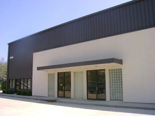
Painting commercial buildings is a major undertaking. Even small commercial properties can require a monumental amount of work, so commercial painters Brisbane rely on specialist equipment and spray systems to get the job done. The right tools make all the difference to the end result, meaning the only hard part is choosing the right colour scheme. The colours you select for your commercial building can have a big impact on your branding and customers, so it pays to get it right the first time. In this article we’ll take a look at some of the most popular commercial building colours and how they can transform your space.
What is Commercial Painting?
Commercial painting is a professional service that can take care of even the largest painting jobs. From touching up defects in retail stores to repainting giant skyscrapers, commercial painting services can handle just about anything. The only real challenge of commercial painting is choosing colours. The colour you choose says a lot about your business, and it can also have an impact on your neighbours. While there are no real limits on which colours you can paint a commercial building, it’s best to consult with a professional before you commit to a paint scheme.
How to Choose Paint Colours for Commercial Buildings
Ultimately, the best colour for your building is the one that suits your branding, services and customers. There’s also no need to stick to a single colour for your entire building! Many building managers choose to use a neutral base, and then add pops of colour with murals, design features and accent pieces. When designing a paint scheme for a commercial building, there are a few things you’ll need to consider:
- Branding. Stuck for inspiration? Look at your logos and other branding items! Tying your building together with your brand is the best way to make the property stand out. Some brand colours aren’t the best choice for painting an entire building, but you can always use accent colours or sections of detail to add flair to the space.
- Services. The colours you use to paint your building say a lot about your business. The right colours can complement your services and create an enticing environment for customers. For example, restaurants and cafes often choose moody colours to create a more intimate setting.
- Lifespan. Commercial building painting can be very expensive, and it’s not something you want to find yourself doing frequently. Unfortunately, bright colours like red and yellow tend to fade quickly in the sun, requiring more frequent touch ups. If you’re going to choose a vibrant paint scheme, make sure you’re investing in quality paint products.
- Climate. That’s right, the climate in your area plays a role in your paint scheme. Brighter colours reflect more light and absorb less heat, making them ideal for hot climates. Be careful about painting your building in black or dark greys if you live in a hot area.

The Best Paint Colours for Commercial Buildings
Your imagination is the only limit when it comes to painting a commercial building. A new paint job is your chance to show off your business and its services, so the best colour is one that’s personal to you. If you need help selecting a paint scheme, commercial painters Brisbane are usually happy to work with you on the design phase. Professional advice can help you select colours that look fantastic and provide decades of protection for your building.
If you’re thinking about repairing your commercial building, some of the colours to think about include:
- White. Shades of white and off-white are the perfect canvas for every building. They allow you to use detail and other design elements to create a building that truly stands out. For buildings with multiple tenancies, white paint schemes also offer lots of freedom for tenants to personalise their space.
- Neutrals. Greys, creams and sandy colours are all nice and neutral. They play nice with most other types of colours – such as the ones found in your branding – and they’re perfect for subtle displays of personality.
- Earth tones. Want to go bolder? Browns, darker greys and deep reds are all perfect for creating moody, inviting spaces. Earth tones are easy to match with other design touches, they hide imperfections and they’re simple to maintain in the long term.
- Bold cours. Those bright reds, blues and yellows might not have the longest life under the sun, but that doesn’t mean they should be crossed off your list! Bold colours are still one of the best ways to show off your branding, attract customers and create spaces that are unique to your business.


